Laimis Andrijauskas
About
This is a modified recreation of a project I had to build while working at a phycial therapy clinic. The goal was to create two dashboards visualising KPIs for the staff performance, as well as for the clinic as a whole.
Data
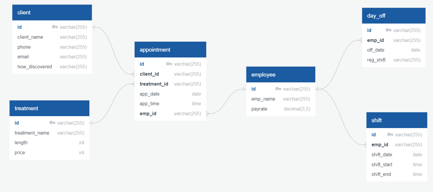
I have created a relational database and populated it with fictional data, created specifically for this project predominantly utilising Python's random module, supplemented by Excel.
- Names, numbers, and emails were generated using an online fake data generator.
- Treatment prices and staff payrates were assigned randomly, using the current price market as a guideline.
- Treatment types were picked at random, but keeping in mind a theme of a physical therapy clinic.
- The appointment schedule was created using Python's random module with some variance in probabilities to simulate trends.
- The time-off (holiday) schedule was biased towards summer breaks, to mimic the tendency to take summer holidays.
Goals
My goals were:
- 1) To create a relational database and import the clients' data
- 2) Query the database and extract data for dashboards
- 3) Use Tableau to build the dashboards
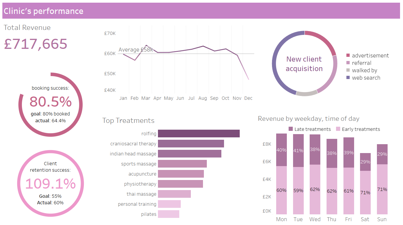
The data displayed in the Clinic’s Performance Dashboard should inform stakeholders about:
- Total annual revenue
- Revenue by month
- Revenue by weekday and time of day
- Most popular treatments
- Client acquisition
- Client retention
- The Clinic’s ‘busy-ness’ (i.e. percentage of treatment slots taken)
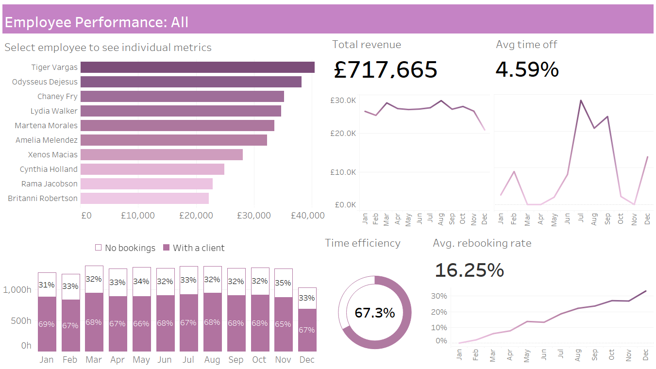
The data displayed in the Staff Performance Dashboard should inform stakeholders about:
- The top employees by generated revenue
- Revenue by month for selected employees
- Time off by month for selected employees
- Retention (defined as the percentage of clients seen in a selected month that have been seen before)
- Employee’s ‘busy-ness’ (i.e. percentage of their shift time that has been booked up)
Methods
- First, I designed a relational database for the fictional clinic using MySQL and QuickDBD.
- Then, I created the tables using Python and Excel and populated them with mock data (for details see ‘Data’ section or visit my GitHub Repo.)
- I queried the data to obtain extracts for Tableau visualisation (as my version of the software does not allow for live connection)
- Finally, I connected the extracted CSV files to Tableau and used it to build the dashboards.


